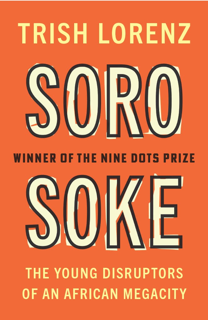
Soro Soke cover: Q&A with Cambridge University Press Designer Lauren Downing
24 March, 2022
Soro Soke: The Young Disruptors of an African Megacity, developed from Trish Lorenz’ 2021/2022 winning entry, is published by Cambridge University Press on 26th May. Designer Lauren Downing describes the process behind the cover for the book, its inspiration and some of the factors the team considered along the way.
What was the inspiration behind the design and what message is it trying to convey?
We really wanted to convey the vibrant people and communities discussed in the book, which is why we opted for a bright, optimistic design and colour palette. We were also inspired by imagery associated with protest since ‘Soro Soke’ is a slogan associated with youth protests against police brutality in Nigeria.
The cover for Soro Soke is typographic rather than image-based. What was the thinking behind that decision?
This was partly to be in keeping with the previous Nine Dots Prize winners, which I go into more detail about later. However, even without this consideration, I think we would have opted for a typographic design for this title. The book’s themes of connectedness and community within vast megacities were so broad and ambitious, tying the book to one community, time, place, or event with an image wouldn’t have captured the scope of the book. Instead, we felt a bold, bright typographic route offered a much greater opportunity to convey the optimism and spark of the young people the book gives a voice to.
Given the need to be consistent across the covers of each Nine Dots Prize book, did this present any challenges?
The previous winners have also had bright, colourful typographic designs, with a key dominant colour and strong use of black. We wanted to use these elements within the Soro Soke cover to create a consistent feel. However, it was important to us that this cover had a different colour palette and typography to the previous covers so that it stands out. These constraints weren’t so much a challenge though as they were the first piece in the puzzle of creating the cover design.
How did you consider the book’s themes of youth and innovation in sub-Saharan Africa?
We opted for a warm, bright colour palette partly to convey the youthful optimism of the people discussed in the book, but also because these colours are associated with the protests where ‘Soro Soke’ is a slogan. We chose bold sans serif typography, partly to echo protest signs, but also to convey the uncompromising, innovative spirit of the people and communities being celebrated.
Soro Soke: The Young Disruptors of an African Megacity is published by Cambridge University in paperback and free via Open Access on 26th May. For more information, visit https://www.cambridge.org/core/books/soro-soke/36752AD4A252F73703D9F701A185F80E.